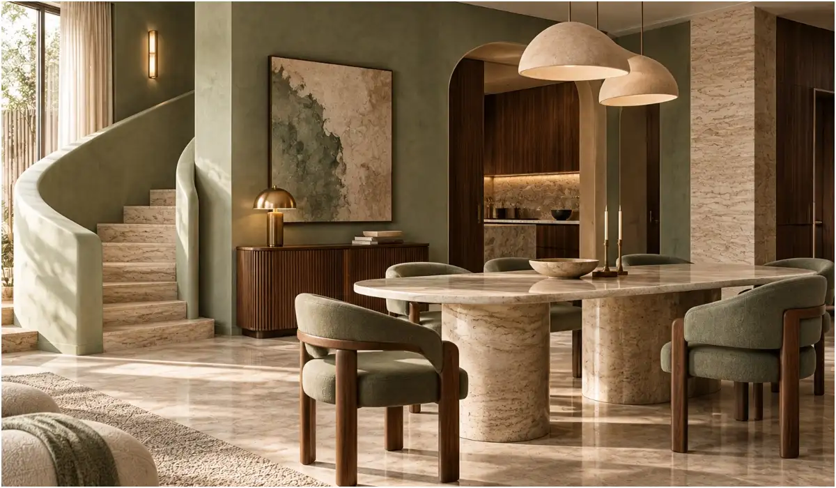
Sage upholstery, dark stone and muted metal finishes create a rich, contemporary look
Dulux’s 2027 Colour of the Year, this soft, grey-tinged shade, pairs naturally with marble, warm timber and brushed metal, creating a backdrop for textures and finishes to shine.
“Its sophistication comes from what you layer around it: beautiful stone, rich timber, aged metals and considered lighting,” says Minnie Bhatt, founder of Minnie Bhatt Design. “The key is to let the colour act as a sophisticated base rather than treating it as an accent alone,” says Monica Chawla, creative head, Essentia. Drawing on her recent work with similar muted green shades, Chawla says, “Such tones can be paired with natural stone, warm wood and tactile upholstery to create a palette that feels understated yet thoughtfully layered. “I would personally lean towards matte, limewash or softly textured finishes for Soulful Sage because they bring out the complexity of the colour,” says Bhatt, adding, “Limewash is particularly beautiful when you want the walls to have movement, as the tonal variation changes subtly with the light and gives the colour an almost artisanal quality. ”
A muted green may not be the first colour that comes to mind when you think of a richly layered home, but Soulful Sage makes a case for seeing green differently. From textured walls to sculptural furniture and unexpected colour pairings, designers share how to give this soft green a distinctly luxurious edge. Soulful Sage works particularly well as a backdrop for statement materials, allowing their textures and natural patterns to shine. Rather than treating it as a decorative accent, designers recommend using it across walls, cabinetry or upholstered furniture to establish a cohesive scheme. For homeowners looking to introduce the shade, the choice of finish matters as much as the colour itself.
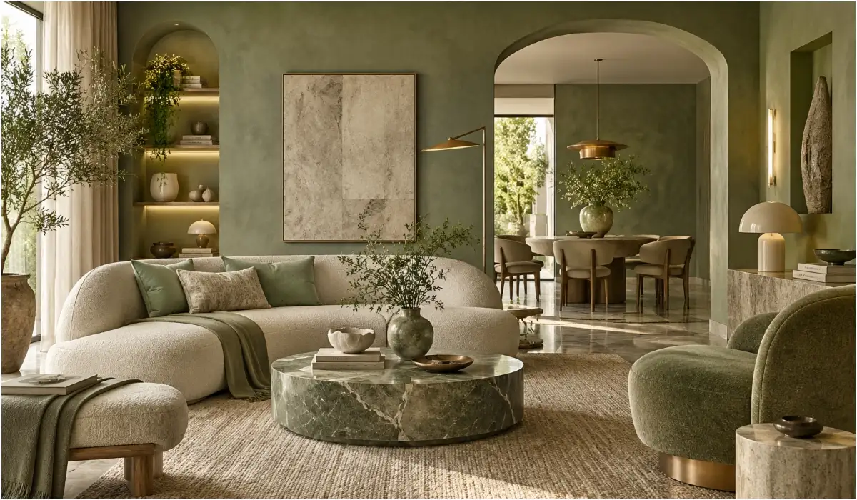
It takes the colour in a more earthy direction and gives it depth without losing its softness,” says Aashna Saran, founder and creative director of Aashna Saran Home. She says, “These warmer and darker tones add contrast without taking away from Sage’s calming quality. She says, “A statement chair, an unusual side table or a contemporary Indian accent can add personality without making the scheme feel rustic. For timber, a medium to dark walnut would add warmth and depth,” she says. In upholstery, velvet would work particularly well for a more luxurious look, while bouclé or linen can keep the overall palette softer and more understated,” she says. “The idea is not to make everything the same shade but to create a layered green and earthy palette where each element complements the other,” he says. Spaces to avoid: Aashna Saran says she would avoid using it as the dominant colour in children’s rooms, preferring more playful, energetic shades Consider natural light: “I particularly like using Sage green in spaces with good natural light because the colour changes beautifully through the day,” says Sethi You use AI every day.
cream and sand make natural companions for Sage, designers suggest looking beyond the expected neutrals to give the shade a richer, more contemporary character While beige. “I would pair Soulful Sage with rust and warm brown tones. She adds, “Natural wood can anchor the palette, while antique or brushed gold accents introduce a subtle sense of luxury. For those willing to experiment with a more layered green palette, Karan Sethi, founder of Qube Designs, recommends combining different shades of the colour. “If you have Sage green on the walls; bring in emerald green through furniture, upholstery or smaller details to create depth. Deeper hues can also lend the muted green an unexpected edge. Chawla suggests experimenting with deep burgundy, chocolate brown, muted terracotta and restrained charcoal. The furniture you choose can determine whether Soulful Sage feels contemporary, rustic or traditional. The trick is to introduce silhouettes that complement the colour without making the room feel overly coordinated. Bhatt favours sculptural contemporary pieces, including curved sofas, organic-shaped tables and rounded occasional chairs. However, she also sees value in mixing styles. “A beautifully aged timber piece, an antique accent chair or a classic silhouette against Soulful Sage can create the layered, collected quality. On the other hand, Saran prefers modern, clean-lined furniture to offset the colour’s inherent softness. Experts suggest letting a few distinctive pieces stand out rather than filling the room with competing shapes and finishes. Mixing materials and textures adds depth to Soulful Sage while keeping the overall look modern. Saran recommends balancing natural materials with contemporary finishes. “For stone, I’d choose a warm travertine or a softly veined beige marble rather than anything too stark or high-contrast. Chawla recommends warmer metal finishes. “For metals, brushed brass or an aged bronze finish can add a subtle layer of richness without making the space feel overly ornate. For flooring, Karan Sethi, founder of Qube Designs, recommends Baroda Green or Verde Green marble, or lighter beige marble with subtle green inlays. “Soulful Sage works well with marble, travertine, and fabrics such as velvet, bouclé and linen. Mixing these materials and textures adds depth and warmth, making the space feel rich without looking too overdone” – Monica Chawla, creative head, interior architecture and design-build firm Overloading the palette: Avoid too many bright or contrasting colours that overpower the muted green Ignoring material balance: Pair marble, travertine and dark wood with lighter fabrics and open spaces. Seal stone surfaces properly and clean them regularly to prevent stains. Choosing the wrong finish: Use matte, limewash or textured finishes for depth. Clean them gently to avoid marks, and reserve glossy finishes for select elements Making everything match: Can combine different shades of green, earthy neutrals and contrasting textures “The biggest mistake is failing to balance Sage green with the rest of the space. Stick to an earthy palette, incorporating natural materials and subtle tonal variations. Too many bright or contrasting colours can overpower its understated appeal” – Karan Sethi, founder of an interior studio Living room: Use Sage on walls or larger surfaces, pairing it with earthy furniture and lighter beige or sand tones for a sophisticated backdrop Bedrooms: Opt for a softer, monochromatic palette to create a calm, restful atmosphere. Dining spaces: Introduce contrast through furniture, lighting or deeper shades of green, such as emerald. Now get your AI Quotient. Take the AIQ test Get the latest Lifestyle News and more. Download the TOI app.