Michael Duggan
Because it’s all red on the map or it’s the government’s problem to fix, they double down on this idea that there’s nothing they can do as an individual. Because climate change affected their lives very differently. ’ How does literacy — or the lack thereof — impact the experience a person has of a map, we found divergences in how people in the United Kingdom, where climate change is present but not in the extreme ways it is in India, read the same maps compared to someone living in Delhi — how they viewed those colour palettes differed.
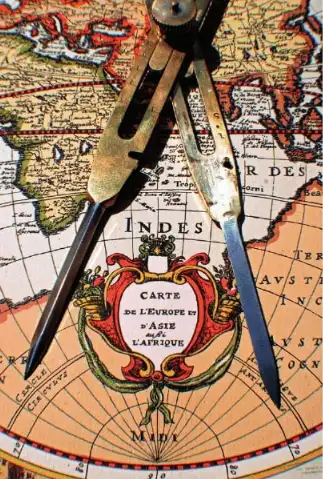
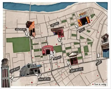
Describing his research, Duggan says, ‘I am interested in how we use maps on an everyday level. Duggan says, ‘Having a more nuanced conversation about how maps are read is very important. There is often an assumption maps are used in the same way universally. I’m trying to understand key differences in how we use maps. Geographical representations are often girded by power — who makes the map drives our worldview, how we see ‘home’, ‘distant’ and ‘wealth’ and how we imagine many of life’s possibilities. Colonial map-makers, for instance, meticulously drew where coal, gold and iron lay — but all for the benefit of the coloniser and not those whose land it was. Similarly, traditional mapmakers represented Earth as a series of political and geographical features, a very human, criss-crossed world, overlooking animals, birds and fish inhabiting this planet as well. The Anthropocene is not just an era of relentless plundering thus — it is also aeons of seeing the world incorrectly. Duggan replies, ‘Yes. In climate mapping, this is a very big issue. Climate change is often documented through maps which convey global warming worldwide. These use red and green at times to show big problems versus things that are okay. The issue is, they can play on people’s fears — if you see a map covered in red, this indicates a really bad situation. That isn’t helpful in getting people to change their views or activities. Duggan elaborates, ‘A recent project I did was about how we perceive maps of climate change. United Nations maps here contain excellent information. But while the science is great in showing what’s happening, how that is communicated to the public, and ideas about positive measures put forth, can get stymied by presenting things in stark colour contrast. What would he suggest? Our personal backgrounds make a difference. Duggan explains, ‘If you’re at school, you get taught formally what a map or atlas is. However, a lot goes on outside that formal educational environment — children figure out their locales by revisiting the same places. THE NEW OIL: Location data, shown by GPS, is an enormously rich industry However, the formal grid is taken more seriously than someone just explaining their locale. This has serious implications — ‘Indigenous communities know their local environment much better than any outsider. Yet, an outsider can turn up with a formal map and say, ‘I know this land better than you’ and take away land rights, start resource extraction, etc. There is power — and legality — in the way we imagine our geographies. ’
Do today’s maps also shape — even misshape — our understandings?