
Image: AI
Because it does not have to be packed away after the celebrations, green is particularly practical for festive homes. Red also works well when introduced through fabrics that can be changed easily.
Managing Director of Notandas Realty, the focus is on creating homes that feel both elegant and comfortable, according to Harsh Jagwani. “Homeowners today aren’t just pursuing ways to beautify their living spaces, but they would like to achieve a cozy and elegant atmosphere,” he says. “A festive home must include crafting elements such as hand-hammered brass bowls or hanging lamps that not only give light but also represent a traditional outlook,” he says.
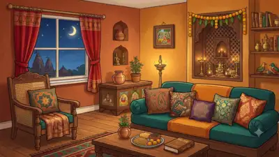
A room dressed in red does not have to look like a wedding venue. A green wall can feel luxurious without a single gold ornament, and a brown sofa can make a living room look warmer than an expensive new piece of furniture ever could. The secret lies in choosing colours that work together rather than competing for attention. This festive season, home styling is moving beyond the familiar combination of bright colours, shiny surfaces and elaborate decorations. Think mocha brown walls, peacock teal cushions, peach-toned corners and carefully placed cardinal red accents. Add the glow of brass lamps, the texture of handwoven fabrics and lighting that changes the mood after sunset, and even a familiar room can feel different. The idea is not to redesign the entire house for one celebration. It is to choose a few colours and materials that make the space feel inviting during the festivities and remain relevant long after the decorations come down. Grey and white have long been popular choices for contemporary interiors, but deeper browns offer a different kind of appeal. Mocha brown brings the warmth of cocoa, wood and earthy textures into a room without making it look overly decorated. The shade works particularly well in living rooms, where an accent wall, a suede-finish sofa or brown upholstery can anchor the rest of the decor. Pair it with oak furniture, travertine surfaces or brushed brass details to create contrast without introducing too many competing colours. For festive gatherings, this palette also provides a useful backdrop for lamps, flowers, candles and traditional decorative pieces. Brass stands out against brown, while cream-coloured cushions and lighter fabrics keep the room from feeling too dark. Red has a natural place in Indian celebrations, from festive clothing and flowers to traditional textiles and decorative details. A more restrained approach can make the shade feel sophisticated. A cardinal red silk table runner, a pair of velvet dining chairs or a painted wooden decorative piece can provide just enough colour to draw the eye. The trick is to let red stand out against quieter shades such as beige, taupe or warm white. A runner, cushion cover or upholstered accent chair can add a festive touch without committing the room to a permanent makeover. Peacock teal, with its blue-green depth, can give a room a distinctive character without relying on elaborate decoration. The shade works on a statement wall, an upholstered chair or silk cushions with embroidery. Against ivory, pale stone and natural wood, teal becomes a focal point while allowing the rest of the room to remain understated. It can be especially effective in a living room where guests gather. Rather than adding several decorative objects, a homeowner could use a teal chair, a few cushions and a brass lamp to create a coordinated look. Teal also pairs naturally with the warmth of wood and metallic finishes. The combination gives a room visual depth, making it feel carefully put together without requiring every surface to be decorated. If painting a wall feels like too much commitment, cushions, curtains or a single accent chair offer an easier way to experiment with the colour. Not every festive room needs a dramatic colour. Peach blush offers a gentler alternative, bringing a soft warmth to spaces that might otherwise feel plain or stark. Pair it with ivory walls or bedding, rattan furniture, light wood and natural fabrics to create a space that feels bright without becoming visually overwhelming. Peach is also useful for people who prefer subtle festive styling. A few peach cushions, a textured throw or a small arrangement of flowers can introduce warmth without changing the room’s entire appearance. Green can do more than add colour to a room. Sage offers a softer, muted look, while olive green brings greater depth. Both can work with brass bowls, stone sculptures, wooden furniture and corners illuminated by warm lamps or candles. An olive velvet sofa can become the main feature of a living room, while sage walls provide a quieter backdrop for framed botanical illustrations, handwoven cushions or indoor plants near a window. This approach also fits into the broader idea of biophilic design, which incorporates natural elements, materials and patterns into indoor spaces. The aim is not simply to add a few plants, but to create a room in which colours, textures and natural materials work together. A green wall, sofa or set of cushions can remain part of the decor throughout the year, with flowers, textiles and lighting adjusted for different occasions. Choosing the right palette is only part of the process. Materials, lighting and decorative objects determine how those colours look once they come together in a room. Jagwani points to artisanal details as a way of adding character without overcrowding a space. A marble-inlaid tray, an ikat cushion or a brocade table runner can introduce craftsmanship and texture without taking up much space. These pieces can also bridge the gap between contemporary furniture and traditional Indian decor. Jagwani also highlights textured wall finishes, including lime plaster, and ribbed surfaces on cabinetry as ways to add visual interest. Even scent can contribute to the experience of a room, with vetiver oil diffusers offering an earthy note. The aim is to create a space that feels inviting rather than simply decorated for photographs. Using all five shades in equal measure can overwhelm a space. A more practical approach is to choose one dominant colour, introduce a second through furniture or furnishings, and reserve the stronger shades for smaller accents. For instance, mocha brown or sage green can form the base of a living room. Peacock teal can appear through cushions or an accent chair, while peach adds softness and cardinal red provides a small but striking festive detail. A brass bowl, a handloom runner or a marble-inlaid tray can help bring the palette together. Repeating a material or finish across different parts of the room also creates continuity, even when the colours themselves are varied. The most useful rule is to consider what can remain after the festivities. Paint, large furniture pieces and expensive upholstery are long-term decisions; cushions, runners, flowers and smaller accessories are easier to change. A well-styled festive home does not necessarily need more decoration. Sometimes, a warm wall colour, a textured cushion, a carefully placed lamp and one beautiful handcrafted object are enough to change how a room feels. As Jagwani’s approach suggests, the lasting appeal of festive styling lies in balancing colour, comfort and craftsmanship. You use AI every day. Now get your AI Quotient. Take the AIQ test Get the latest Lifestyle News and more. Download the TOI app.